Showing posts with label web site. Show all posts

Tuesday, February 7, 2017

Squarespace Ain't What It Used To Be....

My new home page which is now a gallery of 20-some images with a little bit of everything included
I'm not quite sure what's up with Squarespace but it doesn't seem to be the same old reliable website design/creation website that I have been using for several years. Over the past few months, I have noticed that my site was taking longer and longer to load, so long that it was becoming a concern. It wasn't because of anything I had done to the site in terms of adding anything or changing things up so I was pretty sure it wasn't due to something on my end.

My new logo - out with
my full name (Miguel
Antonio Olivella and
instead using the name
most people know me
by - Mike Olivella.
The straw that broke the camel's back was when I was told by several people that they had tried to visit my site but that when they clicked on a gallery, loading was insufferably long. So much so that they gave up and moved on to other sites.

That will not cut it. So I contacted Squarespace and asked what was going on. Using Live Chat, I was told by a techie that the likely culprit for slow loading was that my pages had too many images and that the images' file sizes were too large. I was also told that my pages would load a lot faster if I followed some of their guidelines (which I know were never in existence when I first signed on to use Squarespace):
  1. Reduce the file sizes of my images by limiting the pixel width to their "suggested" 1500 px width, and never wider than 2500 px;
  2. Compressing the images so each file size was no more than 500 KB in size; and
  3. Keeping the overall content of each page (in the case of photography sites, photo galleries) to less than 5 MB total per page.
My Home page, just like all my other gallery pages, gives users the option of switching from seeing one large image to a grid based display. Clicking on any of the images in the grid enlarges it to full size.
With all due respect to Squarespace, these "guidelines" are fine for content based web sites but they won't work worth a flip for photography web sites. Do the math - if a gallery page is limited to 5 MB in size and each image is 500 KB, that means each gallery is necessarily limited to 10 images that are only 1500 px wide and are artificially compressed (read quality drastically diminished). That's absurd for photography intensive sites which is how Squarespace originally cut its teeth in the website design/template arena.

Clicking on "SPORTS"
now reveals three Sports
galleries - Team,
Individual, and Art. 
In redoing the site, the
navigation menu for the web has
changed. "FEATURED" is my
 new gallery.  
Photography website designers and consultants will tell you that photo galleries should contain 20 or so images to adequately illustrate one's work. So for Squarespace to "recommend" that page content be limited to 5 MB is not even close to realistic for photography.

Further, how in the world can Squarespace advocate guidelines that "suggest" a 1500 px wide limitation when many of its templates display images in a full bleed format?  Hellooooooo, Squarespace - an iMac has a screen width of well over 2500 px so a full bleed image needs to be 2500 px wide. If you reduce a 2500 px wide image to 1500 px in width you necessarily decrease the visual quality because the image must be stretched by the template to become full bleed. In addition, you further diminish the quality by compressing that 1500 px wide image it to keep it under 500KB which makes it look even crappier when stretched to full bleed.

Not exactly how I want my images displayed for prospective clients, Squarespace.

But the alternative is no better. If it takes too long for an image or a gallery to display, it doesn't do me any good to have 2500 px wide images that are each 1 to 1.5 MB in size, the typical file size for a 2500 px wide JPEG image that is saved in the highest possible quality. No one will ever see them because they will have moved on to another site before the images ever load.
A new page, "Featured" will give me a chance to post recent, notable images in a small gallery
Anyway, after going back and forth with Squarespace for the last few days, I finally bit the bullet and reluctantly resized all of the images on my web site. Using Lightroom, they are now all 2000px wide and have been compressed so as not to exceed 600KB in file size. That's as much of a compromise as I'm willing to make.

I've also added a new photo gallery in my Personal Projects - images from my visit to the 9-11 Memorial in NYC
I then went through each of my galleries and revamped them. Those that exceeded 25 images were split up into at least two galleries. For example, my USA travel images are now in two galleries, one consisting of color images and the other black & white images, each gallery containing no more than 25 images. My old Sports gallery is now three galleries - Team (for football, basketball, baseball, etc.), Individual (for tennis, golf, etc.), and Art (my artsy fartsy, pageantry, non-action type of shots). 


So now my galleries are 20MB or less in total overall size. This is in contrast to my old galleries that ran anywhere from 50 to 60 MB in size.

Preliminary testing shows a noticeable increase in loading speed but still not as seamless as I expected. I'm not quite sure whether that is Comcast's internet service's fault or Squarespace's fault. It remains to be seen whether anyone else will have the same experience or whether they will notice any image degradation so if you're reading this I'd appreciate any feed back as to whether you notice any loading issues or loss of visual quality in the images.

New "Contact" page
Since I had to dig in and revamp the site, I re-did the About page as well as the Contact page. The way the template I'm using is set up, these pages default to the left side of the page instead of giving me the option of centering them. I wish I knew enough about writing code to fix this but I don't. So, I'm contacting Squarespace and asking their techies to help me edit the code to fix this.

Time will tell whether I stay with Squarespace. A lot depends on the feedback I get from people now that I've gone to the trouble of shrinking my image sizes and compressing them. Stay tuned.

Monday, January 11, 2016

Re-Pimped The Pimped Web Site

New cover page
Seems like I can't leave well enough alone. After having recently pimped up my web site, I just couldn't resist the urge to go back and try something different. So, I switched templates, redesigned the cover page, and generally speaking revamped the whole thing.

Switching things up is pretty simple in Squarespace if you don't expect an enormous amount of flexibility. The Squarespace templates are designed to be used by folks with limited amount of web design skills, forcing you to use their pre-determined features within each template. Don't get me wrong, there is a certain amount of flexibility in terms of changing things up within a template but not like you'd be able to do if you were writing the code. Alas, I have no idea how to write code so to a great extent I do what I can within the Squarespace design and am thankful to have a decent looking site after I'm all finished.

I had been using the Momentum template but after checking out some of the newer offerings by Squarespace I decided to go with Fulton. I am still designing my own opening page (Home) by using the Squarespace Cover Page offerings. These pages are really meant to be used as one page web sites but with some tweaking, I use one of the templates as my web site cover page.

The Fulton template allowed me to design the various image gallery pages so that on opening they default to a grid layout of images rather than a slide show of individual images. Clicking on any of the images immediately transforms the view to a full page slide show and a click on the "X" in the top right corner takes you back to the grid. Clicking within the enlarged image advances the slide show from image to image if you choose to remain in the slide show format. I also like the width of the grid which is 1200 or so pixels wide rather than extending full width of the screen and the banner that you can create across the top using an image of your choice.


I tried my best to keep the design simple and clean, resisting the urge to muck things up with clutter. Let's see how long this permutation lasts….

Monday, June 29, 2015

All Done Pimping My Website

Designing the new cover page on Squarespace
My original Squarespace site
For a few weeks now I've been working on unleashing the Gods of Websites on my poor old tired site. They say change is good so I dove in and gave the site a completely new look - new template, new logo, new fonts, new image display, and even new images. The new design was the brainchild of my female offspring unit who I decided to bring into the process to take advantage of her brand new degree from Florida State in Digital Media and Graphics Design.

The more recent site before its renovation
It's was hard for me to let go of my affinity for all thinks tacky and gaudy but slowly, patiently, she persuaded, cajoled, and nudged me to a new design that was much cleaner than anything I had dreamed up by myself in the past. I wrote about the design process recently (here) so I won't go into that aspect of the process again.

After the site was redesigned, I thought the hard work was over since Squarespace converted all of my portfolio galleries into the new format seamlessly. Then I came up with the notion that maybe it was time to put some new images on the site so I could include stuff that came out of my camera bodies over the past year or so, maybe even throwing in a few other images that had special meaning to me but I had never processed.

Little did I know that going through thousands of images and then trying to select, re-process, and limit the number of images would be light years more difficult than redesigning the site. But it's all in the rear view mirror now as it's finito.

New shot in the "Football" gallery
New shot in "The World" gallery
At first I was just going to add one gallery with a few sports, studio, scenic, travel and people shots. As I poured through my desktop hard drives copying and pasting possibilities into a portable hard drive I paid no attention to quantity. As images popped up on my preview screen, if they caught my attention for one reason or another they were copied and pasted for processing. When I was all done, I opened the hard drive only to find that I had copied and pasted well over 1,000 images. Yikes. Talk about a big gallery. I realized there was no way to reduce that number to a manageable gallery of 30-35 images so I went to Plan B - multiple galleries with images grouped into the same themes in my Portfolios. I created folders on the portable hard drive for each genre - Sports, Studio, Black & White, etc. and funneled the images into the appropriate folder.

One of my new Studio shots
Now, the gallery format on the new site initially displays images in a large grid, but clicking on any image transforms the gallery into a full page view of each image, allowing a viewer to click through them full size. So, I had to make sure each image would not only look good in a grid but also when enlarged to full size. Night after night, hour after hour over the past week I sat at my desktop working on images, organizing them, discarding anything that I didn't think was worthy, and putting them into their respective folders. When I was through I still had way too many images but at least the number had shrunk down to less than half of the original number.

A new shot in "The U.S.A." gallery

New shot in the "Other Sports" gallery
To make a very long story short, I started to create the new galleries by uploading all the images that remained. That opened up a new cans of worms. I had way, way too many sports images. Go figure. I didn't want my sports gallery to be dominated by football, baseball, and basketball because I wanted to include images from other sports but I also didn't want to sacrifice some of the football or baseball images just because of a numbers issue. That caused me to gravitate towards breaking down the sports gallery into several galleries - one for football, one for basketball, one for baseball, etc., giving each major sport its own decent sized gallery with a catch all "Other Sports" gallery. Problem solved? Hah. Adding all those galleries made the navigation list at the top of my web site pages look like a book. On to Plan C - figure out a way to condense that navigation links into something readable and easy to follow.

New navigation menu
Going back into the Squarespace design menu I figured out a way to create a "New Images" page with folders, each folder containing the gallery for each genre of images. Hovering on the navigation link resulted in a drop down menu listing Football, Basketball, etc. for easy peezy selection. Not stopping there, I did the same thing with the Portfolios. Much to my pleasant surprise I killed a flock of birds with one stone - a navigation menu that was even cleaner and simpler than before and easy to follow.

New shot in the "People" gallery
I finished up by renaming the galleries and translating those names to the Portfolio galleries. That meant moving images around in the Portfolio galleries since I got rid of "Black & White" and went with a gallery titled "People". I also got rid of the color and black & white travel image galleries and reshuffled images into a galleries for images from the U.S. and images from abroad. I still have too many images in many of the galleries but I just don't have the fortitude to take them down. Supposedly the rule is to keep the number of images on a photography web site gallery to 20 and certainly no more than 30. Maybe someday I'll bite the bullet but for now it is what it is.

New "Football" gallery
New "Other Sports" gallery
New "The World" gallery
New "People" gallery
New "Studio" gallery
New "The U.S.A." gallery
New "Baseball & Softball" gallery
So, here they are. Each new gallery was limited to no more than 35 images. You gotta try to follow the rules at least to some extent, right? That's 7 new galleries containing well over 200 images that are now on my website. Too many? Maybe. I'll live with it for now. I know that's my gaudy, tacky self rearing its ugly head but it's good to let the beast out every now and then.


Friday, June 19, 2015

Houston, We Have A Problem… A Stale, Dated Website Design

My old website design
It was time. Way past time. My photography website needed a face lift and I have been putting it off and putting it off and putting it off. I'd much rather spend my time shooting images rather than dealing with what I consider to be tedious design stuff. Give me a couple of monolights, a soft box, and a couple of pieces of foam core, throw in a model and a white seamless background and I'm all up for an afternoon of shooting. Or send me out to a baseball game, give me a couple of camera bodies, a 400mm f2.8, and a 70-200mm f2.8 lens and I'll think I've died and gone to heaven.

But sitting in front of a computer trying to decide whether to use a white or black background, choosing between Kozuka Gothic Pro EL or Adobe Heti Std R fonts, or testing templates to see which one looks best is not my idea of a good time.

But like shaving or mowing the lawn, it has to be done. My website generates a lot of work for me. When Fill-In-The-Blank University is coming to town to play FSU in fill-in-the sport and they need a photographer to shoot the game/match/series and I'm not on tap to shoot it for FSU, my website is what gives a sports information director the comfort level of knowing that I will do a good job for them and am worth what I've quoted them as a fee. Or when a magazine needs a cover or images for a photo spread, my website gives the photo editor a chance to compare my work with others under consideration.


Getting To Work


Summer is the best time for me to take a break from shooting and buckle down for a website refresh. For the most part, my sports photography obligations are on hiatus until football season begins in the fall and I have a lot more time to devote to pouring over the past year's images for possible addition to the site, tinkering with page design, and yes, font selection.

I use Squarespace to not only host my website but to design it using their quick, simple features
Before diving in to the redesign process, I thought it would be a good ice to do some reading about website design trends for 2015 and more specifically the designs of photography portfolio sites. Prevailing suggestions included using a clean, simple, uncluttered design with white or a very light background and using a cover page as a precursor to actually getting into the nuts and bolts of the site. It also seemed that a new trend was getting away from the single-image, full bleed photo galleries that popped up when navigating to a portfolio page, replaced by a grid style layout that would transform into a large image gallery with a click of the mouse on any image.

Squarespace's template selection page
So off to races last week, I dove into Squarespace's template selection page to test out various templates in demo fashion concentrating on the templates that used grids. Squarespace has a feature that allows you to demo each template before settling on the one you decide to use and after a lot of template installations to sample what was available I settled on "Avenir". None of the templates had everything I thought I wanted but it had the overall look I was trying to achieve. The biggest thing it lacked was a true cover page. Other than that, after playing with the design features inherent to the template, I felt like I could make it work. 


Then, by accident, I discovered that Squarespace was way ahead of me. I guess with the trend of using cover pages on websites becoming more entrenched, the folks at Squarespace added a new feature to its design options - creating a cover page and adding it to any of the templates. Bumbling and stumbling my way through the process of designing a cover page, I went through several permutations and ended up with…. Ta dah, my new website cover page.
New cover page
I also spent some time creating a new logo to include on the cover page and at the top of each of the pages. Here's the final product (L).


So How Does The New Page Design Look?


Sports portfolio page
Studio portfolio page

Squarespace automatically incorporated all of the existing images from my old website portfolios into Avenir's grid styled gallery layout so that was easy enough. Until I'm completely through with the website I'm going with the same images but some will no doubt be replaced with newer images.

Clicking on the first image in the Sports portfolio page opens a full size gallery that you can scroll through.

Full size Studio portfolio gallery

Until now I've never been a big fan of the grid styled gallery layout opting instead to go with the full size style of galleries on my pages. But I now see why the trend has shifted. Not only does the grid style allow a viewer to immediately get a view of several images (and you can adjust the size of the images in the grid to taste), a simple click of the mouse on any image converts the gallery to a full size version that enlarges the images. Viewers now have the option of a quick peek at a large sampling of images or a more detailed view of each image. Best of both worlds, in my mind. I'm diggin' it.


Another change I was able to make with the Avenir template is incorporate all of the portfolios under one navigation link (PORTFOLIOS) instead of each portfolio having a link in the navigation menu at the top of the page. Hovering the mouse over the PORTFOLIO link triggers a drop down menu that lists all of the portfolio pages. This method reduces the clutter in my navigation menu with only four links (for right now). Much cleaner and simpler.

The new Americana gallery still under construction

The new People gallery

The new Black & White gallery
 You may have noticed that I added a caveat to the number of links in the menu - "for right now".  That's because I'm now working on a new page that will be similar to the Portfolio page and will feature new images as I create them. I've started on creating the new pages which right now includes "Americana", "People", "Black & White", and of course sports, studio and travel/scenic images - "All Things Sport", "All My Bags Are Packed", and "Stu-Stu-Studio". All of these pages are under construction as I go through the process of selecting images to include.

What About The Blog?


Old Blog design
With a new website design, I couldn't very well leave my Blog looking shabby. It was also time to give its design a face lift and I wanted to make it more consistent with the new website design. So, enter the new Blog design.

New Blog logo

It got a new logo using the same image I used on the website cover page and a new template. I kept some of the old Gadgets, added some new ones, and reconfigured them. 

The new Blog design
So, it's been a time consuming, painstaking process but I like how everything looks. Looking forward to adding the new pages and offering clients a chance to see new, different images as the construction process winds down.

Cheers, and Happy Father's Day to all you dads out there.

Monday, March 17, 2014

Web Site Refresh

My new website home page
It was time. My website has been in its prior permutation for a while and a little voice inside me kept telling me, "Bro, it's time to do something new with the site." Change the template, change the layout, throw in some new images, take down some old images, yadda yadda yadda, but still keep it clean. So I went to my Squarespace design page and started playing around with different templates. I was using the "Wells" template and after demo-ing a few others, I found a new one I hadn't seen or tried out - "Native". The template gave a me a framework that was different from "Wells" but still gave the site a look I liked. Once I installed it and started modifying the pages to suit my design ideas, it took about a week to tweak everything and I finally hit the "publish" button last week.

I'm a huge Squarespace fan. I've been using their site to build my website for over a year and find it to be light years better than other sites like Wix. Because of my innate Cuban-ness, it's impossible for me to resist urges to clutter up sites with a lot of crap that only detracts from the goal of presenting a clean, slick, simple display of my images. Squarespace must know there are people like me who are their own worst enemies and have a built in method of protecting me from me. In using their templates you have just enough flexibility to create a site that's uniquely yours, but options are limited so you don't ruin a good thing.

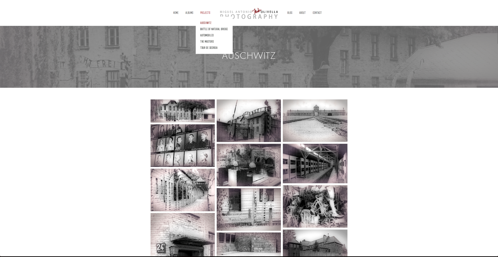
In redoing the site, I merged some of the galleries. The old sports and sports pageantry galleries have been combined into one gallery.  My travel images, some of which were in a color gallery, some in a B&W gallery, some in a gallery dedicated to National Parks, and some in a landscape gallery, are now either in one color gallery or a B&W gallery. I finally have enough astrophotography images to dedicate a gallery to those images. Galleries for light painting, wildlife, composites, cars, & Auschwitz remain. I've added new images and deleted other images from just about all the galleries as images I consider worthy of showing replaced others.


 A page dedicated to my Blog is linked in the navigation block at the top of the page and I separated the old Contact page into two, an "About" page with some tidbits about me and a straight up contact page with info on how to contact me.


As time permits, I still need to go through the images and make final cuts. Some galleries have way too many images to suit me and so begins the task of weeding out some. I have a bad habit of saving the hardest task for last, and deciding which images should be deleted is the hardest thing in the world for me since a lot of images have great sentiment attached to them.

If you'd like to check out the new version, click here. As always, any thoughts or comments are appreciated.