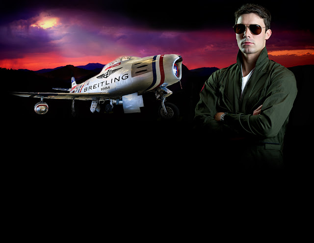
But just because I am not paid to be involved in the creation of the final copy for an ad doesn't mean that I can't do so for my own amusement. So, I recently took a page from Breitling's ad campaigns that feature cool aircraft, expensive watches, and outdoor scenes and put together my own version of a Breitling ad that included all of the bells and whistles.
Using the quick selection tool in Photoshop and the refine edge feature, I was able to cut the Sabre out from the background, saving it for later insertion into a different background.

I then turned my attention to finding that perfect background. I tried several different scenes but I ultimately opted for the simplicity of a silhouetted mountain scene at sunset. I thought the colors would work well with some tweaking and the sun peeking through a break in the clouds would allow me to add shafts of light shining down on the Sabre. The way the image faded to almost black along the bottom was also conducive to expanding the canvas with black where the ad's text would ultimately reside.

 Next up was my pilot. I wanted a Top Gun kind of look so I posed a model as shown (L) with a wrist exposed. That is where I would later add the Breitling watch that was going to be featured in the ad.
I also wanted the pilot image to have a moody look to it. so I gave it my best shot through lighting. The key light (left part of the face as you're looking at it) was metered at f11 while the fill light (on my right) was metered at f4 to create a dramatic shadow on the left side of the pilot's face. I used a snoot on both lights to limit the light spill and that created a nice light drop-off/shadow as you go from the face to the body. Once again, using the quick selection tool in Photoshop and using the refine edge feature, I cut out the pilot from the image and saved it for later insertion into the background.
With some of my puzzle pieces falling into place it was time to drop the Sabre into the background. Through various layers, I adjusted the shadows below the fuselage to blend the Sabre into the background with the hopes of making it look less like a dropped in cutout and more like a Sabre actually photographed on site.
It was time to add the third puzzle piece, the pilot. With the Sabre on the right side of the image, the only logical place to insert him was on the left. When I did that, I had a nagging feeling that it just didn't look right knowing that I still had other puzzle pieces to add in the form of text, the Breitling logo, and an image of the watch to name a few things. So as an experiment, I flipped the image horizontally.
For some reason, this orientation just looked better to me notwithstanding the lettering that was now reversed. That wasn't a big deal as I had planned on removing the "U.S. Air Force Skyblazers" and replace it with Breitling lettering and logo.

I moved the light shafts into place as if they were coming from the sun, warmed the color a bit, and softened/blurred them. I then enlarged the canvas below the image with a black addition and blended it in to the image. As an afterthought, I removed the Top Gun patch from the pilot's flight suit. Later on, I added the Breitling yellow logo as a patch on his left arm.
I did some research on the F-86 Sabre so I could compose the text in the add. I also read a bunch of Breitling's marketing literature on the watches and came up with the following. The slogan "Aviation is in its DNA: came to me at the last minute and I thought it fit perfectly - short, sweet, and if I may say so, catchy:


3 comments:
Cool.
Excellent final ad Mike! Thanks for stepping through the stages of completion and your thought processes
Dexclusive is selling authentic brand name watches, with some watches offered with a 75% discount.
Post a Comment